

CASE STUDY
Rebuilding the On e-commerce platform in 3 months with a 7-person distributed team
MY ROLE
CLIENT
YEAR
WEBSITE
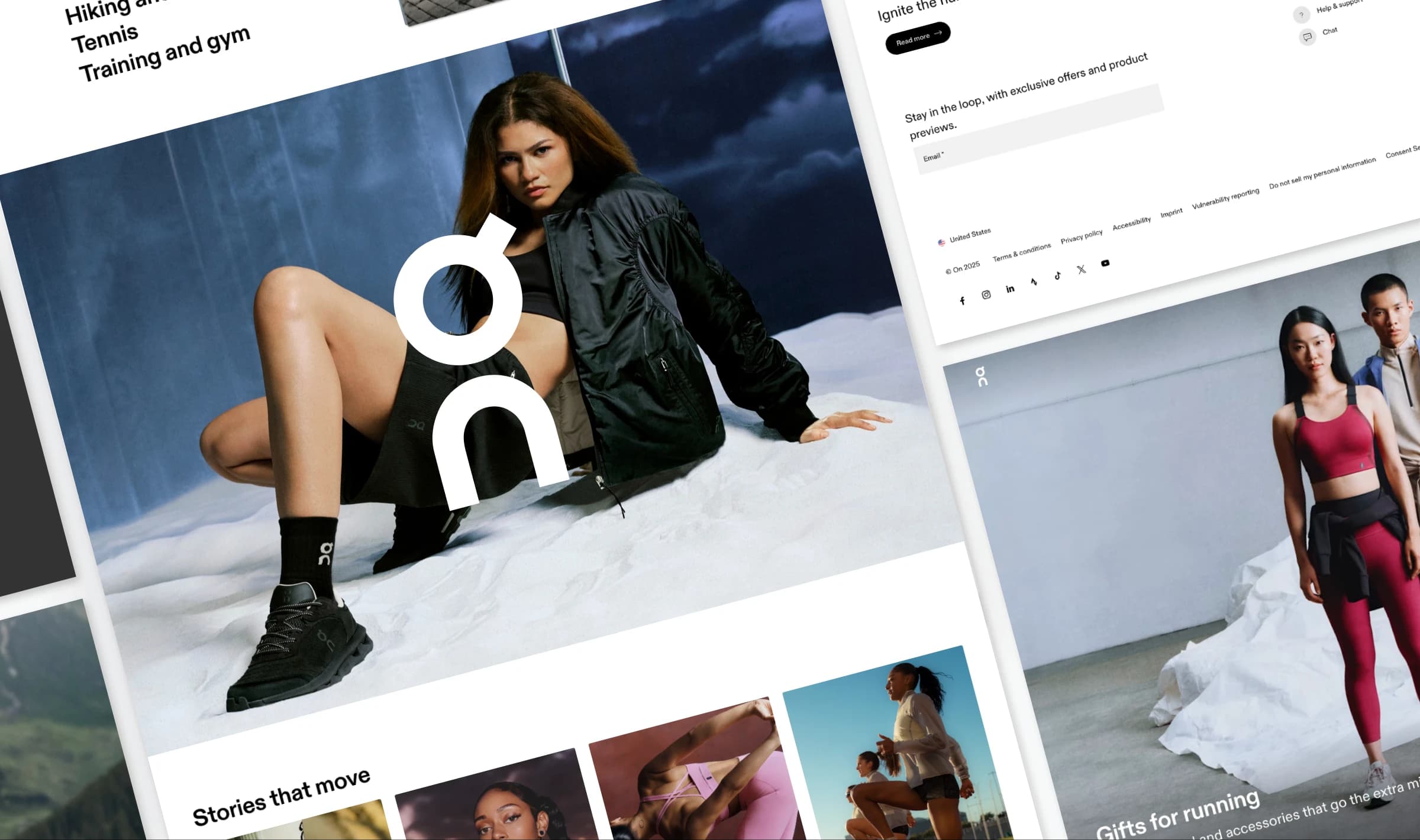
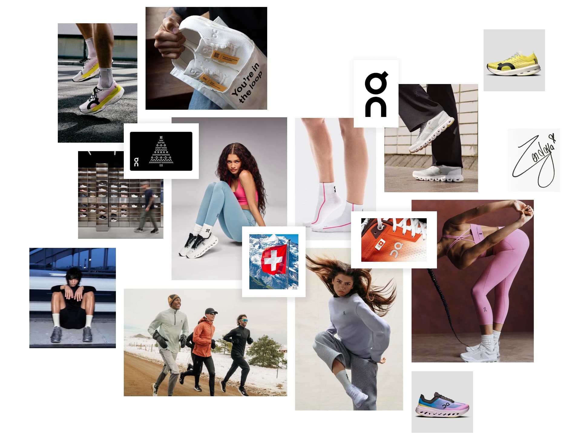
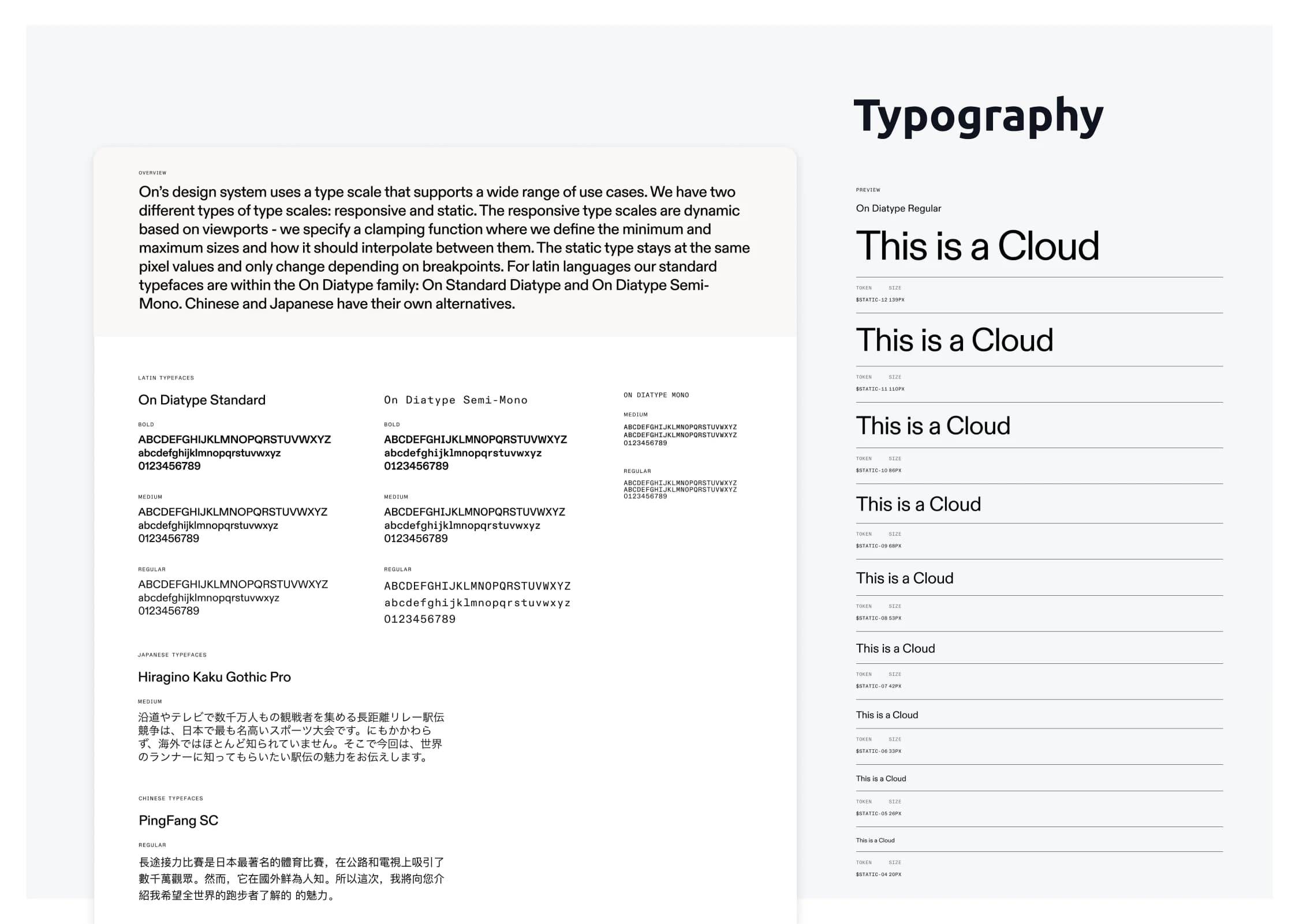
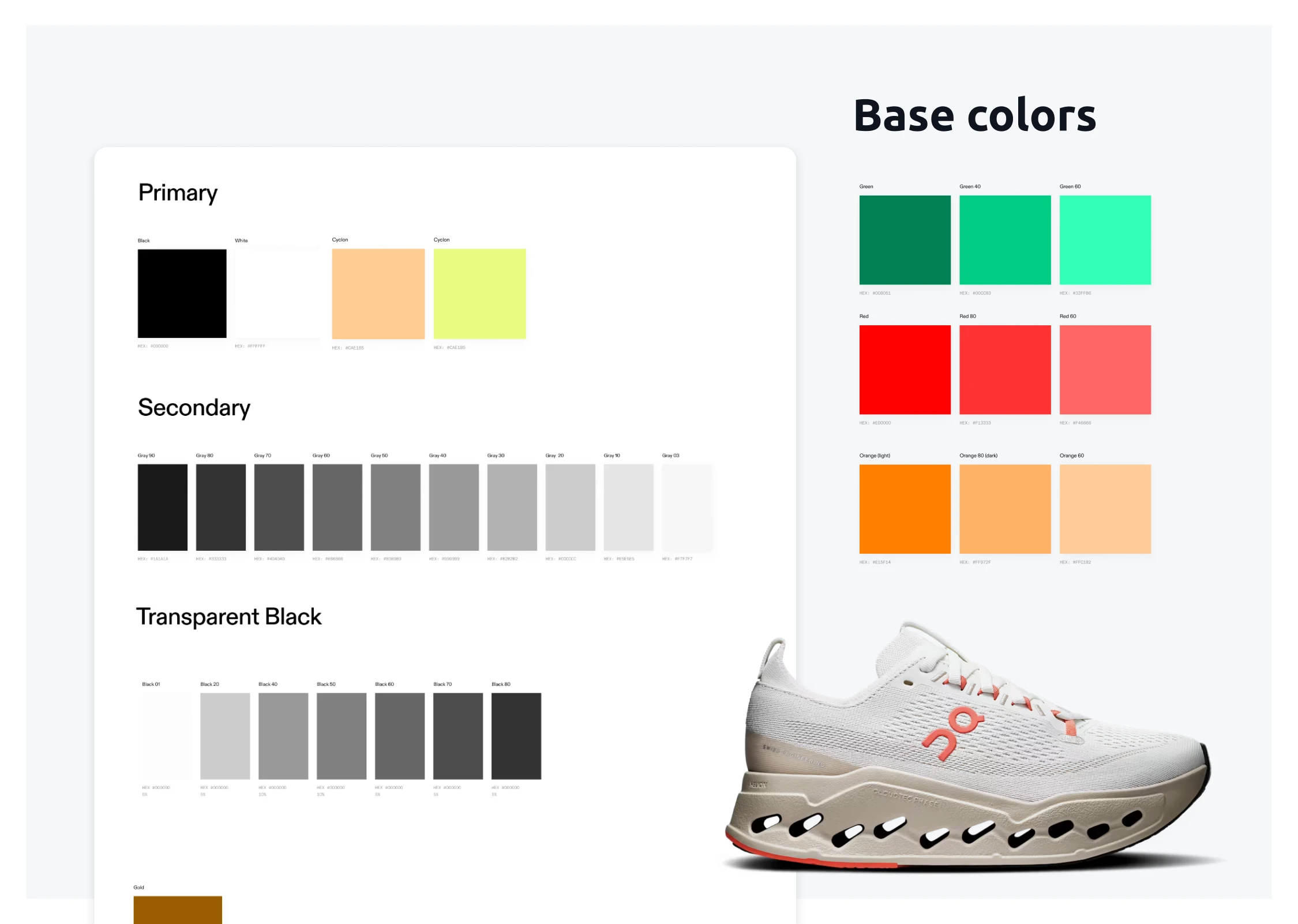
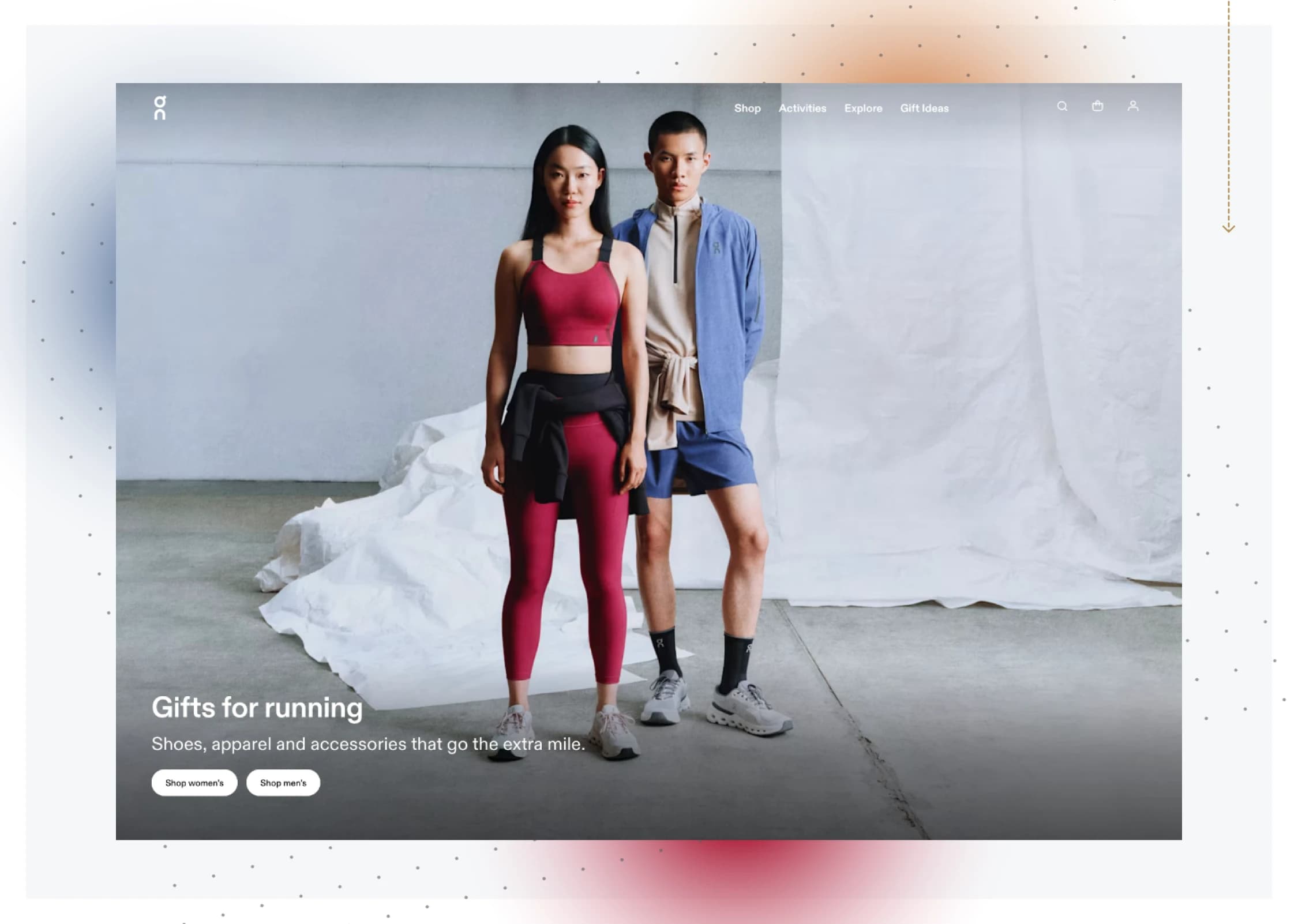
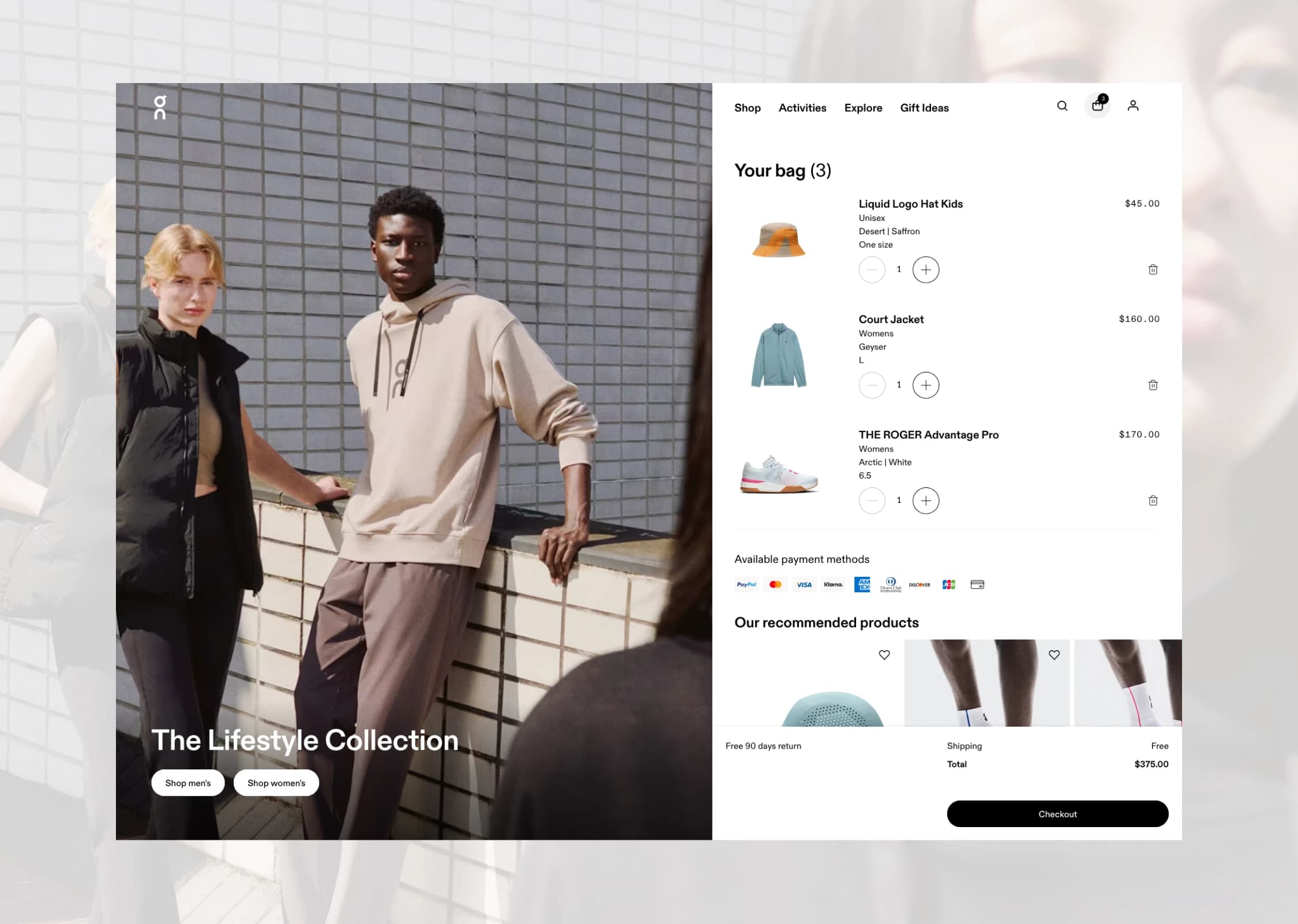
On is a Swiss performance sportswear brand with frequent product drops across footwear and apparel and ~15.3M monthly global visits, about 52% from the US. The site has to feel instant on mobile, stay visually consistent across markets, and let content teams ship campaigns without breaking layout. The brief was a full rebuild on a modern stack with AI in the workflow: Next.js, TypeScript, Shopify, Contentful. Mobile first. Multi-market localization (currency, sizing, hreflang). Core Web Vitals as a hard budget, not a nice-to-have. Three months from kickoff to launch. What shaped most of the work was the gap between the existing Figma system and the inherited codebase. The brand library was strong, but tokens didn't match what the frontend actually rendered, and components had drifted across pages over time. Most of the early decisions were about closing that gap: one token set living in both Figma and Next.js, typed component contracts, and a design-to-code path that didn't lose intent in translation. Everything downstream (performance, localization, content velocity) depended on getting that foundation right first.
4.2s → 1.4s
LCP improvement, mobile
2% → 3%
Mobile conversion rate after launch
7
People on the distributed team I led
3 months
Phase 1 to launch, with 2–3 weeks of buffer reinvested in QA
Challenges
Performance debt and design drift. Similar components behaved differently across pages. Multi-market complexity (domains, currencies, size mapping, translations, compliance) sat on top of an inherited codebase that wasn't built for it. Three months, in parallel, on a new stack. Design and build ran simultaneously while migrating to Next.js + Shopify. Performance budgets, SEO signal preservation, accessibility targets, analytics, experimentation, and content workflows all had to be wired from day one. Weekly stakeholder visibility, distributed team across time zones, single quality bar.
Solution
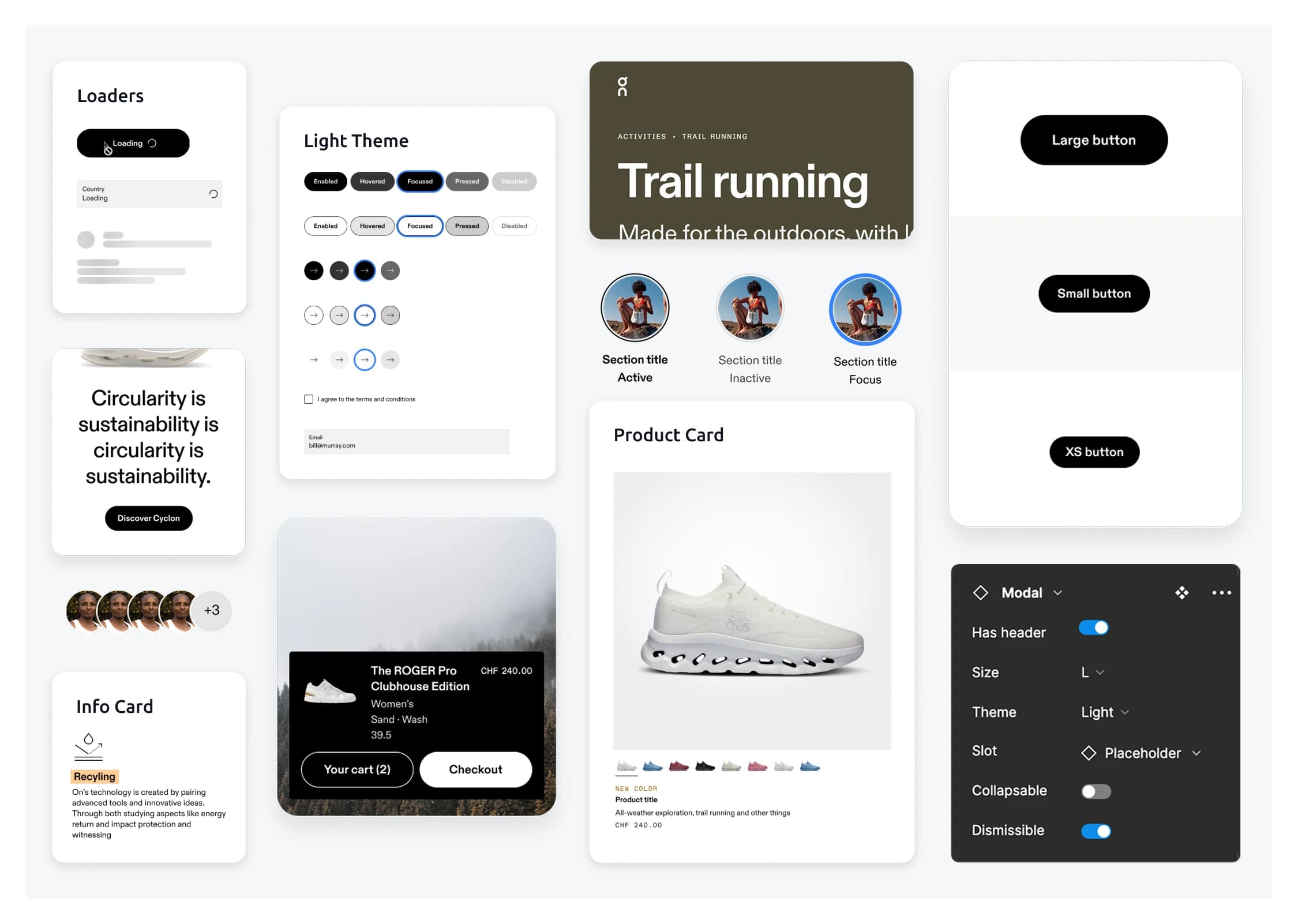
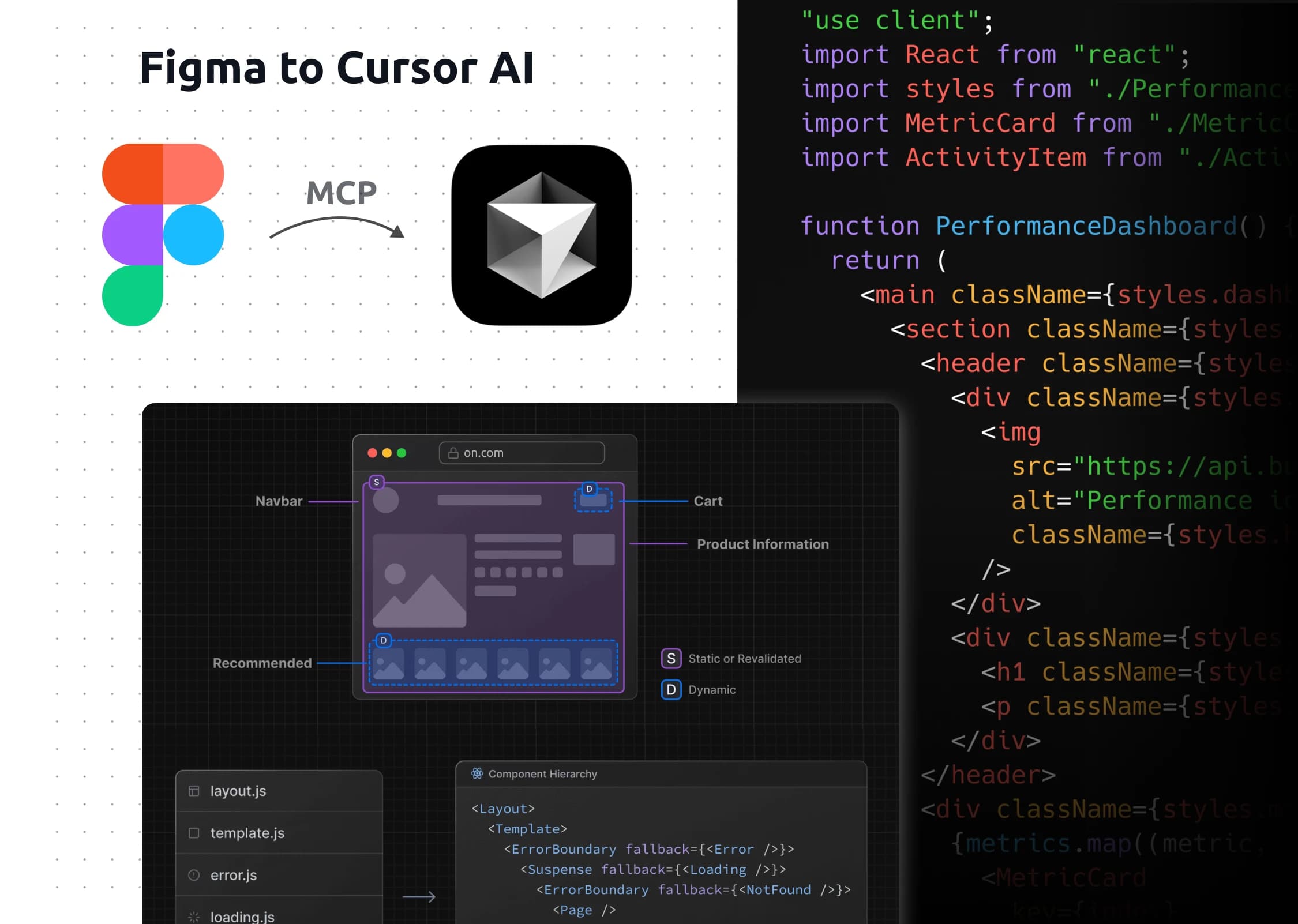
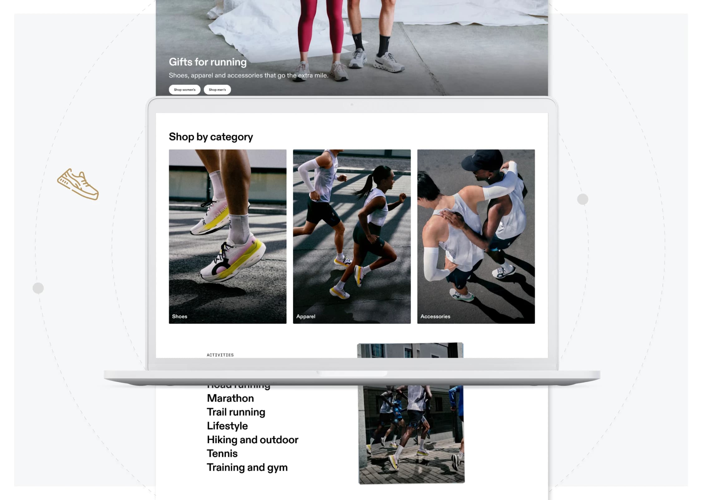
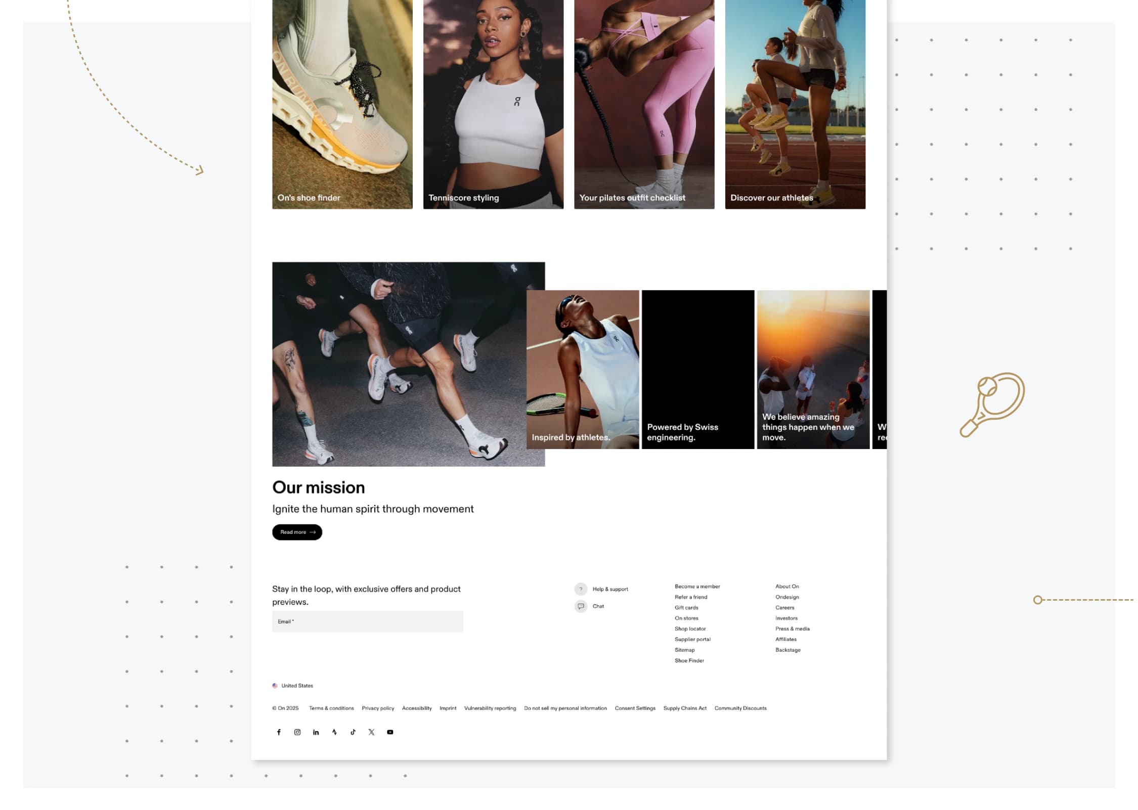
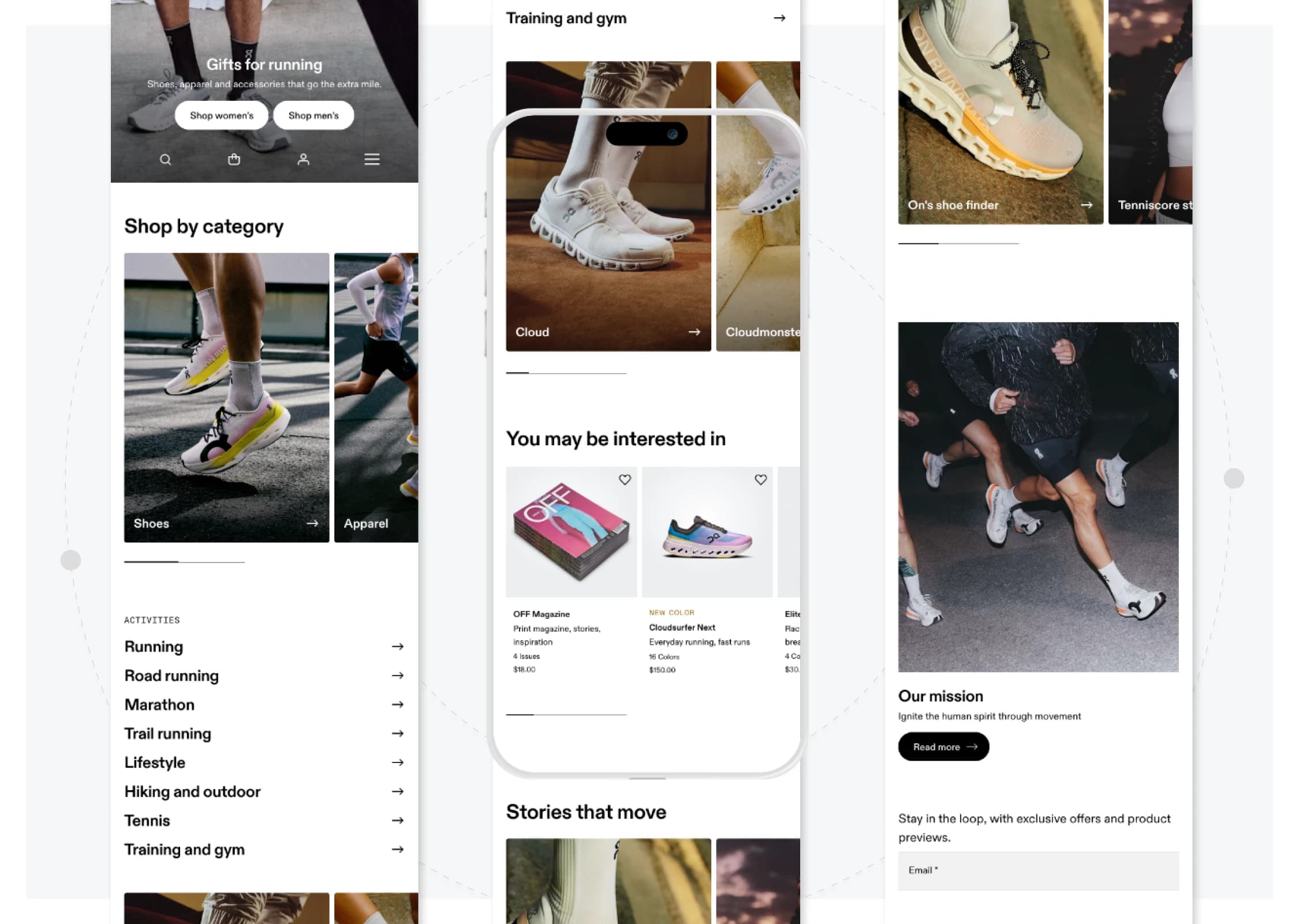
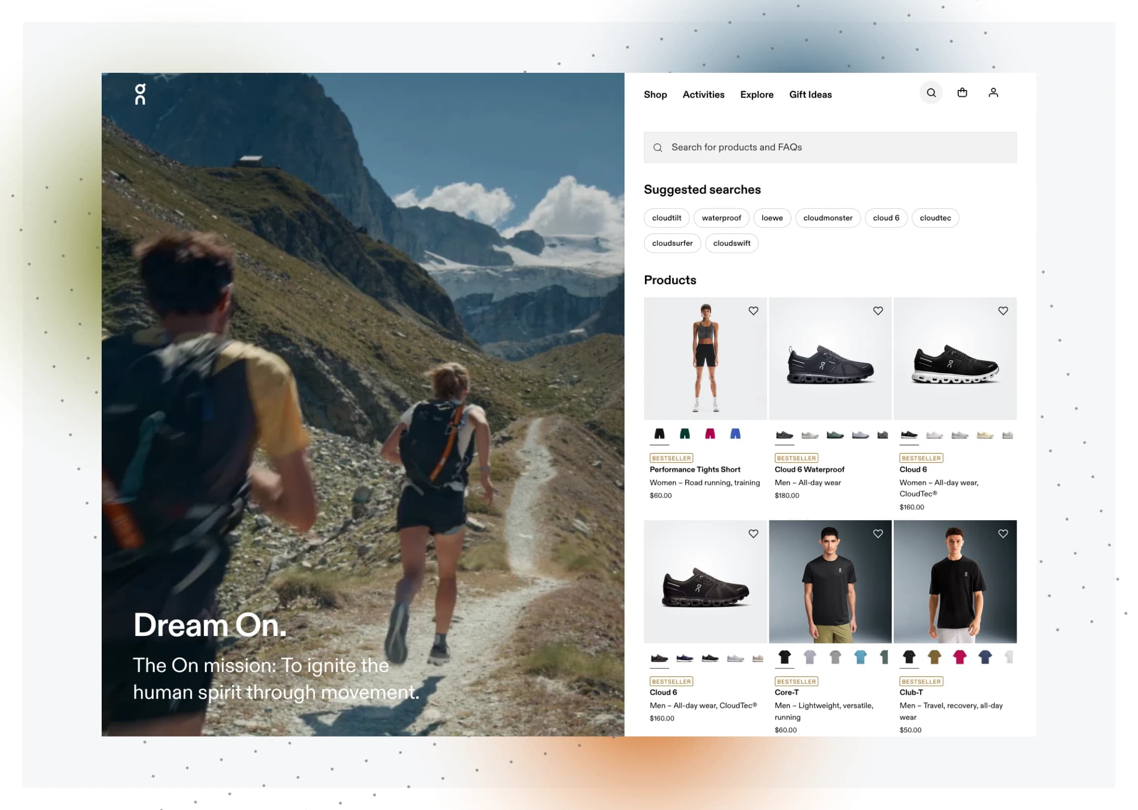
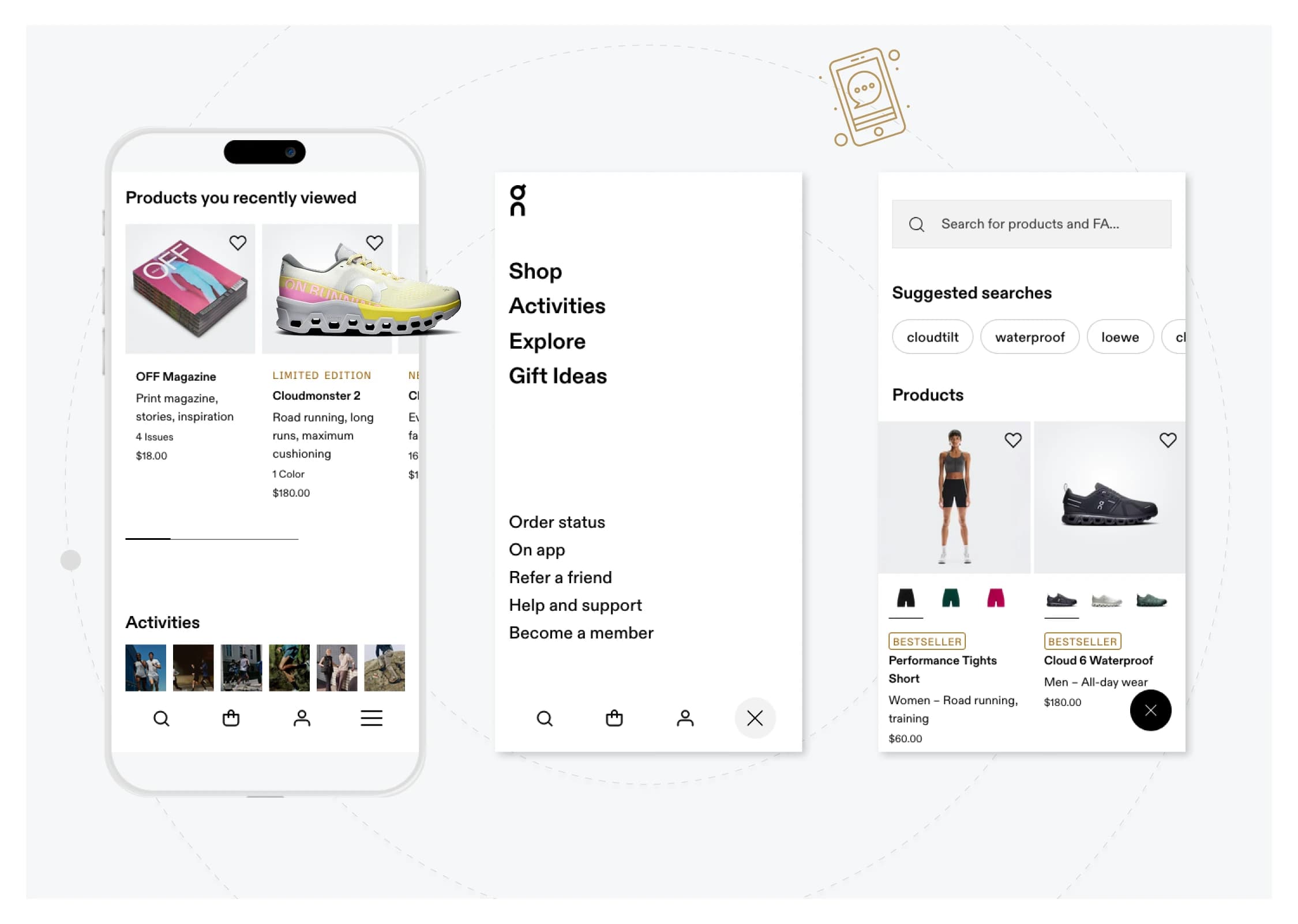
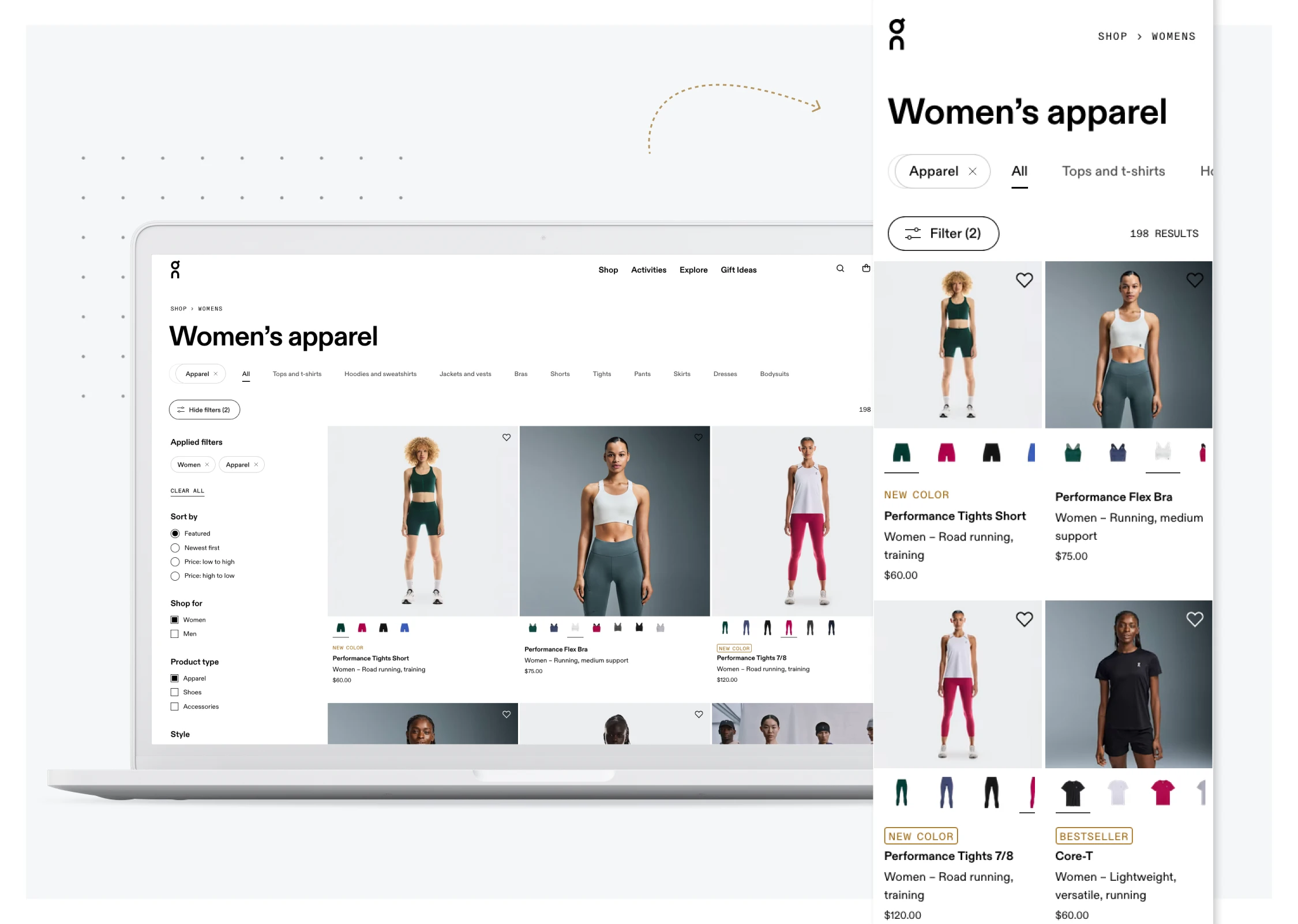
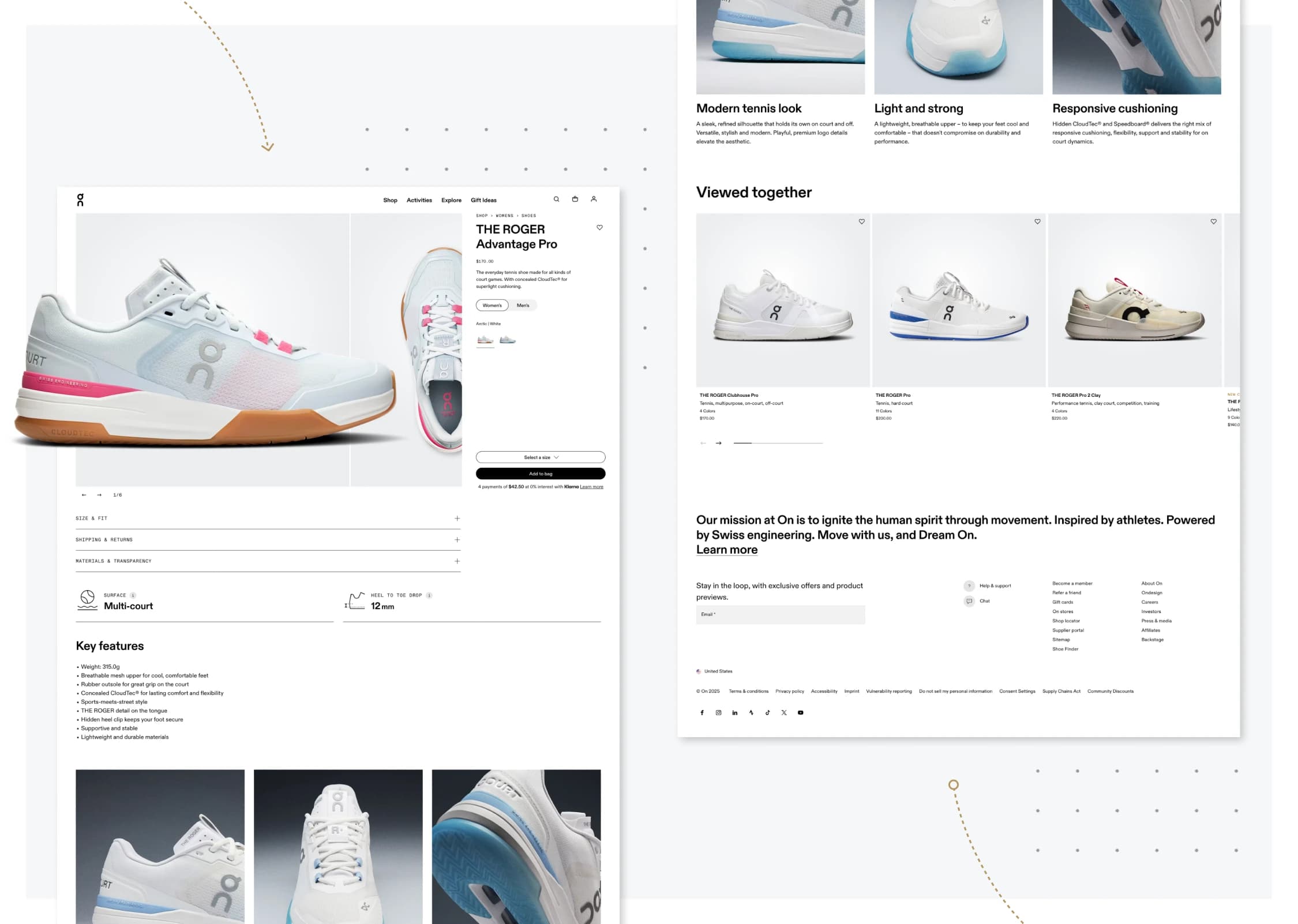
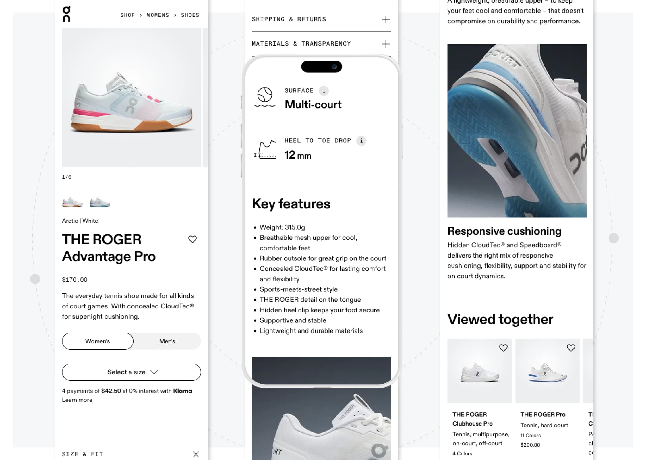
Built a mobile-first responsive design system on top of On's existing Figma foundation, extending it by ~10 to 20% with new patterns, tokens, and components. Tokens aligned 1:1 with the Next.js codebase, so design-to-code stayed lossless. Twenty-plus page templates shipped across PDP, PLP, cart, editorial, and campaign surfaces. The stack: Next.js and TypeScript on the frontend, Shopify for commerce, Contentful as the headless CMS (structured models, localization, roles, previews, webhooks). Edge caching, Next.js Image with WebP delivery, and code splitting brought LCP from 4.2s to 1.4s on mobile. Structured data and clean IA carried the SEO signals. Multi-domain localization handled language, currency, and size mapping across two markets with hreflang and locale-aware URLs. Claude, Claude Code, Cursor, and Figma MCP lived in the daily workflow: component scaffolding from Figma, design-to-code generation, documentation, and code review acceleration. The team shipped 2 to 3 weeks ahead of each milestone, and the buffer went into QA and polish.
Tools and technologies used:
Figma, Figma MCP, Cursor, Claude, Claude Code, Next.js, TypeScript, Shopify, Contentful, Google Analytics, Miro
Leadership
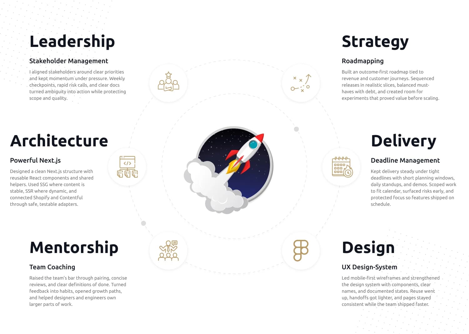
My Role & Team
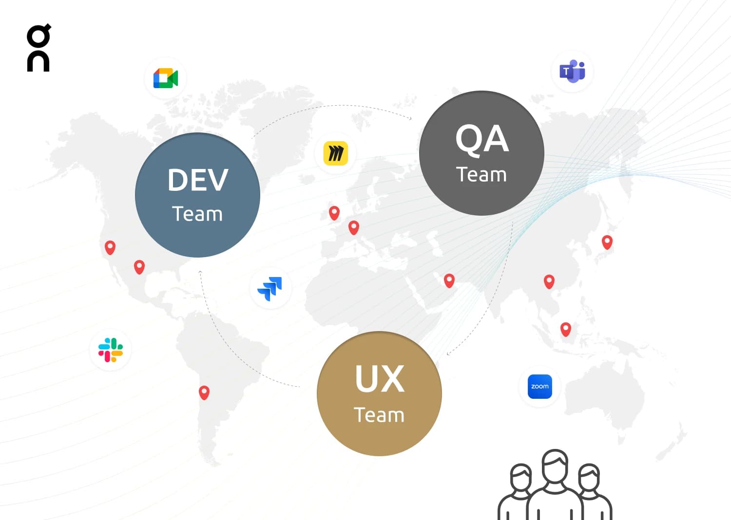
I joined as Lead Product Designer & Design Engineer with a clear scope: take a 7-person distributed team and ship a brand new e-commerce site from zero to production in 3 months. The team was a PM, two UX designers, two frontend engineers, and two QA, spread across time zones, with stakeholders needing fast answers around the clock. My job was to keep design and engineering operating as one unit, remove blockers fast, and own the quality bar across both sides. Set up a few simple habits that did most of the work: clear ownership per surface, short daily check-ins, definition of done, and a shared design system so people built once and reused often. Stayed hands-on in both Figma and the codebase, paired on tough tickets, ran reviews, and mentored without managing. The team hit the 3-month window, landed 2 to 3 weeks ahead on each milestone, and left behind more than a launch: a calm cadence, a token-aligned design system, and a foundation that makes the next release faster.
Visual Design
UX Design & Design System
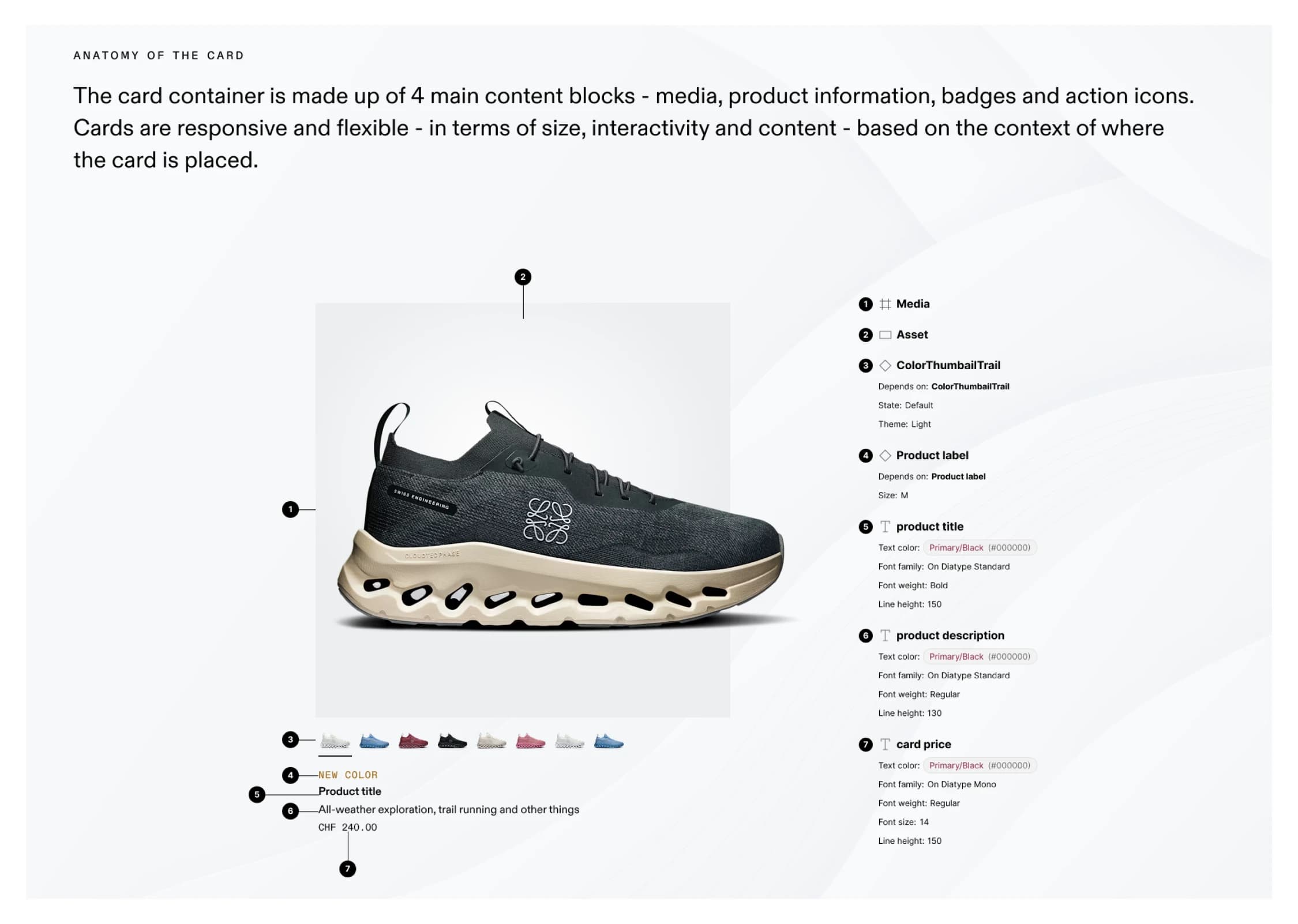
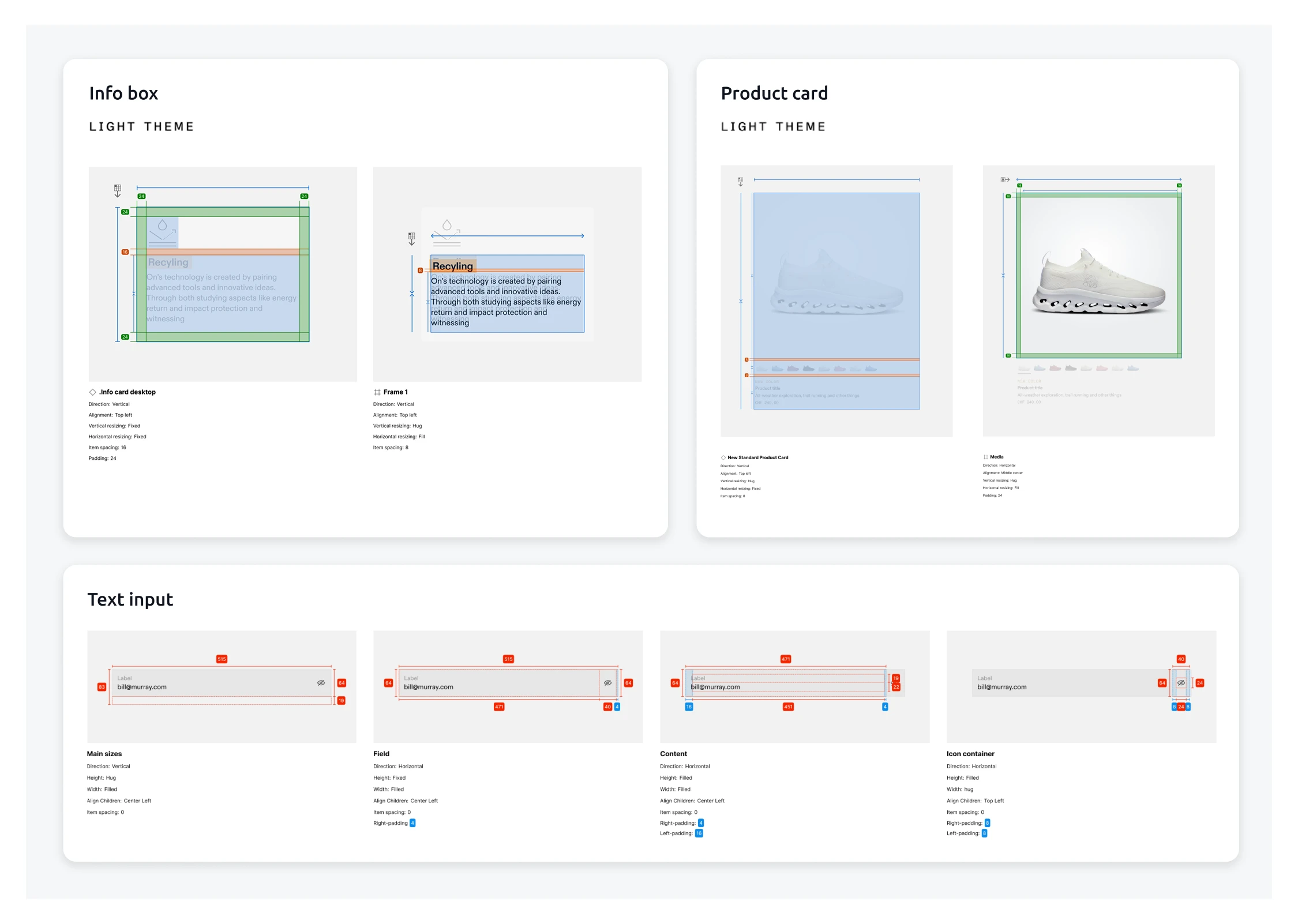
Starting from the existing design system, the task was to map the full site experience in hi-fi while tightening the system itself. I built mobile-first, fully responsive wireframes that locked layout, hierarchy, and states for every key screen. Components and variants followed clear rules for spacing, type, breakpoints, and interaction, with accessibility baked in from the start. Where gaps appeared, the system was extended with new patterns, tokens, and naming so designers and engineers could speak the same language and reuse with confidence. To speed up build, every frame was optimized for a Figma MCP, Cursor, and Claude Code workflow: component specs lived next to the design, tokens matched code, and prompts generated clean scaffolds that mirrored the wireframes. The result was a smooth design-to-code pipeline. The team turned wireframes into reusable components and pages quickly, with fewer back-and-forth questions, less rework, and tighter visual consistency across PLP, PDP, cart, and campaign pages. In short, the system got stronger, the UI stayed consistent, and shipping got faster.
Web Development
Architecture & Engineering Strategy
From day one, the codebase had to help the team move quickly without losing consistency. On the front end, we set a feature-based structure in Next.js with atomic React components, typed props, and shared utilities for state, i18n, analytics, and a11y. Design tokens for spacing, color, and typography mirrored the Figma system, so UI decisions translated cleanly to code. Routing and layouts lived in Next.js, with a balanced mix of SSG for stable pages and SSR for dynamic views, plus lazy loading and image optimization to keep interaction snappy on mobile. On the back end, we used typed adapters to connect Shopify for commerce and Contentful for content, keeping domain logic isolated behind clear interfaces. Webhooks and incremental revalidation refreshed pages when products or content changed, while edge caching on the CDN kept TTFB low across regions. Clean HTML, structured data, and tidy URLs supported SEO and marketing needs. CI ran pre-commit checks, type checks, tests, and preview builds, and a documented component library made reviews predictable. The result was a calm, repeatable rhythm: new components and pages dropped in without collisions, data flows stayed reliable, and load times remained sharp even under launch traffic. Editors published faster without waiting on engineering, developers shipped with confidence, and the platform scaled smoothly across campaigns, locales, and future features.
MULTI-MARKET NEEDS
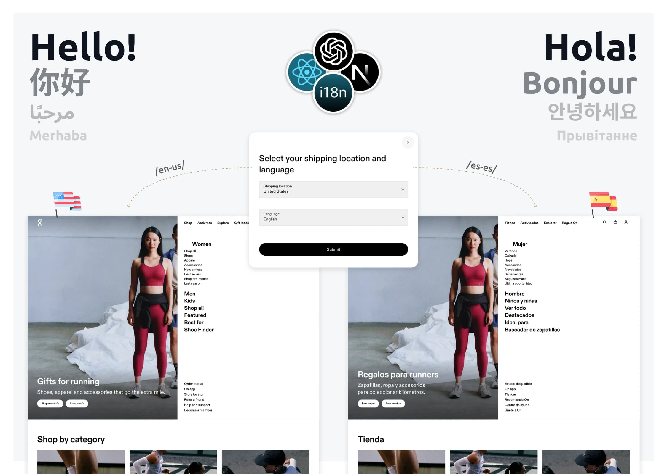
Localization & i18n Strategy
The website needed to feel native in every market, not just translated. A core requirement was dynamic localization with easy country and language switching, plus smart defaults set by domain and regional norms. That meant mapping domains to locales, loading the right currency and size guides, and keeping SEO signals clean with hreflang and tidy, locale-aware URLs. From first visit, users should see the correct language and market rules without lifting a finger, and still be able to switch in a click. I integrated i18n at the framework level and added a locale router that applies sensible defaults per domain, then persists user choices across sessions. Contentful became the single source of truth for copy and assets: localized entries, shared media, editor roles, and preview made market updates fast and safe. Fallbacks prevented missing strings, edge caching kept switches snappy, and analytics carried locale context so marketing could read performance by country and language. Where relevant, the system accounted for RTL and typographic differences, aligning tokens with regional needs. The result is a fast, dependable experience that ships the right language, currency, and compliance by default, and scales cleanly as new markets come online.
STACK & TOOLING
Next.jsTypeScriptShopifyContentfulFigmaFigma MCPCursorClaude Code
Achievements
Summary
The site shipped on time, with measurable wins on the bar that mattered. The platform now handles product drops and seasonal launches as a routine event instead of a release-day exercise. The design system can be extended by content teams without breaking layout, the localization system carries language, currency, and sizing by default across markets, and the design-to-code path stayed lossless across two phases and seven people.

REFLECTION · What I learned
What I learned
- Performance budgets only stick if they're in the plan on day one. Bolting them on at the end is what creates performance debt in the first place.
- Token alignment between Figma and code is worth more than any single component. It's what kept design-to-code lossless across two phases and seven people.
- AI-assisted workflows don't lower the bar, they shift where the bar is. Claude Code and Cursor saved time on scaffolding, but the design and review work got more demanding, not less.